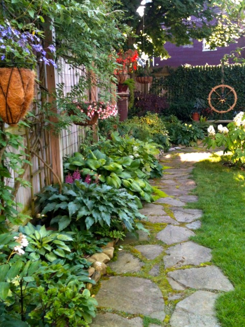
Typography in the garden

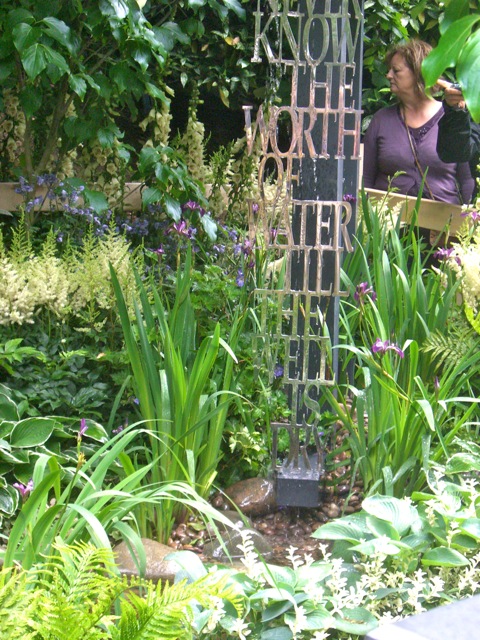
This "Artisan Garden" was an outdoor small-scale garden tucked away in a hilly part of the display area of Chelsea. I was taken with this waterfall/fountain. It reads "We never know the worth of water till the well is dry," a 1732 quote by Thomas Fuller.
Maybe for me, something more like Mitch Hedberg's, "My fake plants died because I did not pretend to water them." Or, W.C. Fields' "I never drink water because of the disgusting things that fish do in it." Or Steven Wright's "I got this powdered water - now I don't know what to add."
Though the dark gray post that served as the fountain's "upright" element helped define the reflective silver letters of the words from one angle, the letterforms were just difficult enough to read against the garden's busyness that you had to pay attention to, and savor, every word slowly.
I really wish I'd taken better photos of it. It was exquisite in its plantings and exactness of placement of everything from typography to plantings.


I love the fountain and the thought. All our water comes from our well.
ReplyDeleteI love words used "graphically" (e.g., subway art). Like it!
ReplyDeleteFantastic and engaging post! If you are searching for the Best Musical Water Fountain, The Fountains Store offers cutting-edge technology, synchronized lighting and sound effects, and customized designs that create a breathtaking and immersive experience for public, commercial, and landscape projects.
ReplyDelete